- Published on
HR Survey Analysis
- Authors

- Name
- Dhiraj Das
Introduction
This is my solution to a guided project by Maven Analytics which consisted of a HR survey response dataset from ~1,500 city employees in Washington state. The challenge was to analyse survey response data and derive actionable insights.
The Tools and Dataset
- MS Excel - All time favorite tool for quick and dirty data manipulation tasks. Simple, easy to use, and efficient.
- Dataset - The data came in the form of an excel workbook. The first sheet was the survey response and the second sheet consisted of a data dictionary outlining the data fields.
Basic exploratory data analysis of the data
Before diving into the project objectives, I wanted to perform a quick and dirty EDA of the data to get a preliminary overview of how the data looks like -
- The dataset has 14,725 rows + 1 header row and 10 columns
- The 'Response' and 'Response Text' column had blanks - we may have to address this later.
- Also, the questions column has some issue because of which there seems to be 2 versions for Question 7
Objective 1 - Profile & QA the data
The first objective was to explore and QA the data by calculating basic profiling metrics, removing blank and duplicate records, and standardizing inconsistent text fields. Here are the tasks -
- Calculate the minimum, maximum, count, and number of blanks for each numerical field
 There are several observations that come out of this -
- While there are 14725 records for the Response ID field, the maximum value is only 14710. This means there are duplicates in this column
- On a similar note, the Response and Response Text fields have 135 blank values.
- Remove any records with blank responses

- Remove any records containing duplicate values across all fields

- Calculate the count or frequency of each value in the Department and Question fields, and standardize any inconsistencies you find

Lets fix these issues -
- The first issue (Q7) can be fixed by simply using find and replace and searching for "at work to learn & grow" and replacing it with "at work to learn and grow".
- The second one was also fixed using find and replace and searching for "satisfied with my job " and replacing it with "satisfied with my job".

Objective 2 - Prepare the data for visualization
The second objective was to produce clean source data for visualization by calculating response frequencies and proportions for each of the 10 survey questions. Lets begin!
- Create a new tab named Chart Source, and generate a unique list of survey questions

- For each question, calculate the count of records associated with each response type (1-4) and the average response, excluding zeros

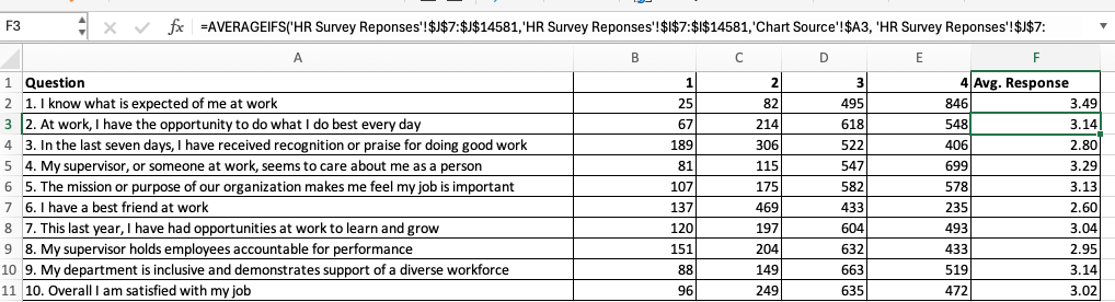
- Add new columns to convert the counts into percentages, based on the total responses for 1, 2, 3 or 4
- Copy and paste the data as values, then sort the questions descending by average response

Objective 3 - Visualize the data and summarize findings
The final objective was to visualize the data using stacked bar charts and Likert scales, and derive insights and recommendations to share with the HR leadership team based on the findings.
- Visualize the percentages as a 100% stacked bar chart, showing the question with the highest average response at the top

- Update colors to shades of orange or red for negative responses (1,2), and shades of blue for positive responses (3,4)
- Add data labels and remove the x-axis, title and vertical gridlines, then format individual chart elements to improve readability

- Based on your findings, what insights or recommendations might you bring to the HR leadership team?
There are several insights that come out of the survey results. They have been summarised below -
- In terms of task goal orientation, 92% of the workers know what is expected from them in their work.
- More than 80% of the workers feel they have someone at work who care about them
- On the other hand, there are around 48% i.e. almost half of the workers who felt they don't have a best friend at work.
- Similarly, many workers reported (35%) that they didn't recieve any recognition or praise for doing good work.
My recommendations would be the following -
- To address the issue of not having a best friend at work, the HR may look at starting a buddy program to foster a culture where the worker can share things with someone from office - not neccessarily on professional front only.
- The HR department may also look at introducing a reward program that appreciates workers for their hard work.
- BONUS: Modify the chart to vertically align the bars so that positive responses skew to the right and negative responses skew to the left (you’ll need calculated columns)
